





I learned about these features recently as I studied for the PL-300 exam, unfortunately I do not have experience in making sure that my reports are accessible but I'll pay attention for these accessibility improvements in the future. Please consider these improvements, they take only minutes per page!
Tab Order
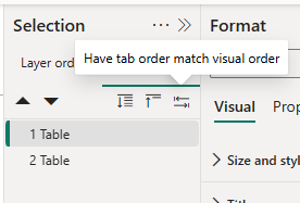
It can be managed next to the layer order on the selection pane. People using screen readers are not navigating via a mouse, they are using the tab button on the keyboard. Usually the charts on the page should be read from left to right and top to bottom which is not easy to detect using the layer order, especially if you are using shapes for background or other technical elements that should be ignored by the reader. You can save time by using the "Have tab order match visual order" button then fine-tune if necessary.
Show as table
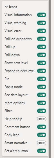
Never remove "See data layout"! It's a common practice to restrict the header icons for most of the visuals for example slicers do not need all the options from this list but this icon makes it possible for screen readers to read the table format of a visual; visual titles are read aloud too. This feature does not convey colors changed by conditional formatting for example status colors of achieving a target. Meaning should not be conveyed with color alone, the fix for a status color is adding an icon, a label, or a dedicated status text column, and that fix helps the screen reader case and the colorblind case simultaneously.
Alt text
Select a visual → Format pane → General → Alt text.
Static text: type a description, max 250 characters. Describe purpose and insight, not appearance: "Monthly revenue by region, showing EMEA trend" — not "bar chart with blue bars." The screen reader already announces the visual type, so don't start with "chart of…". Dynamic alt text: click the fx button and bind it to a DAX measure. You can build a measure like "Total revenue " & FORMAT([Revenue], "#,0") & ", " & IF([YoY]>0, "up ", "down ") & FORMAT(ABS([YoY]), "0.0%") & " vs last year" so the alt text always states the current filtered values. Yes it is somewhat time-consuming to come up with a dynamic title like this but UDFs can help, you could reference the original title of the visual stored in a measure, then use the same conditional formatting that you used for color coding to return up or down. It's useful to have a measure that displays the list of applied filters on the page as well.